Contour Plots with ggplot2

Contour lines, or isolines, are curves outlining the x-y coordinates of a 3D surface having a given elevation. It’s like cutting the tops of mountains off at set elevations, and tracing the shapes formed by the new (flat) mountain tops.
This tutorial introduces two ways to make contour plots using ggplot2, for two different purposes. First, load the tidyverse (which includes ggplot2).
library(tidyverse)
theme_set(theme_minimal())
Method 1: General Contour Plots: geom_contour()
Using this method, you can make a contour plot of any bivariate function.
Basics
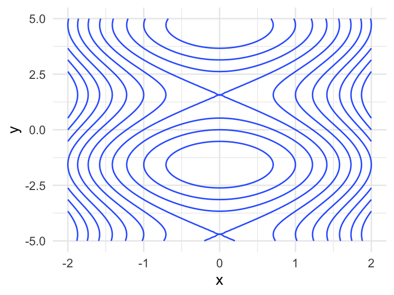
To demonstrate, let’s use the bivariate function $$f(x, y) = x ^ 2 + \sin(y)$$ over the rectangle \(-2<x<2\) and \(-5<y<5\).
f <- function(x, y) x ^ 2 + sin(y)
- Make a grid over the rectangle in a long-form data frame. It must be a grid –
geom_contour()won’t work otherwise. Theexpand_grid()function in the tidyverse (orexpand.grid()in base R) is handy for this, filling in all combinations of its input. Our grid will be\(100 \times 100\)points.
## Make a data frame with columns x and y defining a 100x100 grid.
x <- seq(-2, 2, length.out = 100)
y <- seq(-5, 5, length.out = 100)
dat <- expand_grid(x = x, y = y)
## Inspect data frame.
dat
## # A tibble: 10,000 × 2
##        x     y
##    <dbl> <dbl>
##  1    -2 -5
##  2    -2 -4.90
##  3    -2 -4.80
##  4    -2 -4.70
##  5    -2 -4.60
##  6    -2 -4.49
##  7    -2 -4.39
##  8    -2 -4.29
##  9    -2 -4.19
## 10    -2 -4.09
## # ℹ 9,990 more rows
- Evaluate the function at each of the grid points, forming a third column that we’ll call
z.
## Add a column containing the function evaluation.
dat <- mutate(dat, z = f(x, y))
## Inspect data frame.
dat
## # A tibble: 10,000 × 3
##        x     y     z
##    <dbl> <dbl> <dbl>
##  1    -2 -5     4.96
##  2    -2 -4.90  4.98
##  3    -2 -4.80  5.00
##  4    -2 -4.70  5.00
##  5    -2 -4.60  4.99
##  6    -2 -4.49  4.98
##  7    -2 -4.39  4.95
##  8    -2 -4.29  4.91
##  9    -2 -4.19  4.87
## 10    -2 -4.09  4.81
## # ℹ 9,990 more rows
- Use this data frame with ggplot2’s
geom_contour(). Thexandyaesthetics should be the two grid columns (also calledxandyin our data frame), and thezaesthetic should be mapped to the column with the evaluated function (also calledzin our data frame).
## Add a `geom_contour()` layer with aesthetics x, y, and z.
ggplot(dat, aes(x, y)) +
  geom_contour(aes(z = z))
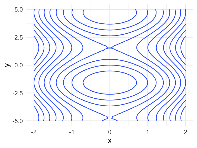
Grid Size
The \(100 \times 100\) grid used above makes for a smooth surface, and only requires 10,000 function evaluations.
x <- seq(-2, 2, length.out = 10)
y <- seq(-5, 5, length.out = 10)
expand_grid(x = x, y = y) %>%
    mutate(z = f(x, y)) %>%
    ggplot(aes(x, y)) +
    geom_contour(aes(z = z)) +
    theme(axis.title.y = element_text(angle = 0, vjust = 0.5))
Example using the volcano data
R comes with a dataset containing the altitudes of a volcano, Maunga Whau (Mt Eden), stored in the datasets variable volcano. You’ll notice that the dataset is literally a grid of \(87 \times 61\) altitudes – here are the first six rows and columns:
volcano[1:6, 1:6]
##      [,1] [,2] [,3] [,4] [,5] [,6]
## [1,]  100  100  101  101  101  101
## [2,]  101  101  102  102  102  102
## [3,]  102  102  103  103  103  103
## [4,]  103  103  104  104  104  104
## [5,]  104  104  105  105  105  105
## [6,]  105  105  105  106  106  106
If you’d like, you can take a look at a 3D rendering of the volcano using the rgl package’s surface3d() function. The code for doing this is directly in the documentation of the surface3d() function.
In order to make a contour plot with ggplot2’s geom_contour(), we’ll first need to turn this into a tidy data frame with three columns. You could use as.vector(volcano) to get a vector of altitudes, and line that up with a grid laid out as two columns, but I’m not going to take any chances here, so I’ll opt to use pivot_longer(). We don’t know much about the latitude and longitude, so their values are arbitrary.
(volcano_tidy <- as_tibble(volcano, .name_repair = "universal") %>%
    mutate(latitude = 1:n()) %>%
    pivot_longer(!latitude, names_to = "longitude", values_to = "altitude"))
## # A tibble: 5,307 × 3
##    latitude longitude altitude
##       <int> <chr>        <dbl>
##  1        1 ...1           100
##  2        1 ...2           100
##  3        1 ...3           101
##  4        1 ...4           101
##  5        1 ...5           101
##  6        1 ...6           101
##  7        1 ...7           101
##  8        1 ...8           100
##  9        1 ...9           100
## 10        1 ...10          100
## # ℹ 5,297 more rows
Fix up the longitude (taking the negative to reverse the order, because data are provided as east to west):
(volcano_tidy <- volcano_tidy %>%
    mutate(longitude = longitude %>%
               str_remove("[\\.]{3}") %>%
               as.numeric() %>%
               `-`()))
## # A tibble: 5,307 × 3
##    latitude longitude altitude
##       <int>     <dbl>    <dbl>
##  1        1        -1      100
##  2        1        -2      100
##  3        1        -3      101
##  4        1        -4      101
##  5        1        -5      101
##  6        1        -6      101
##  7        1        -7      101
##  8        1        -8      100
##  9        1        -9      100
## 10        1       -10      100
## # ℹ 5,297 more rows
Now the contour plot comes for free:
ggplot(volcano_tidy, aes(longitude, latitude)) +
    geom_contour(aes(z = altitude)) +
    theme_void()
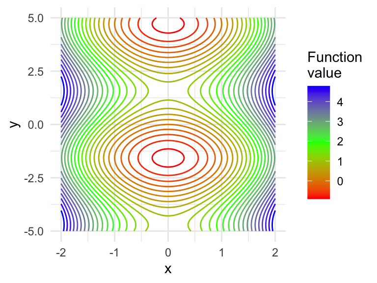
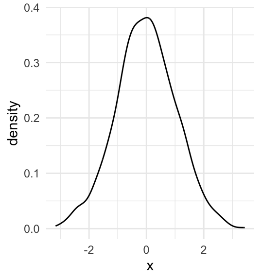
But, you can’t tell that the inner circles actually represent a hole (a caldera), not a peak. Let’s add colour by mapping the ..height.. “variable” to the colour aesthetic of geom_contour(). This will also create a legend for altitude.
ggplot(volcano_tidy, aes(longitude, latitude)) +
    geom_contour(aes(z = altitude, colour = ..level..)) +
    theme_void() +
    scale_color_continuous("Altitude")
## Warning: The dot-dot notation (`..level..`) was deprecated in ggplot2 3.4.0.
## ℹ Please use `after_stat(level)` instead.
## This warning is displayed once every 8 hours.
## Call `lifecycle::last_lifecycle_warnings()` to see where this warning was
## generated.
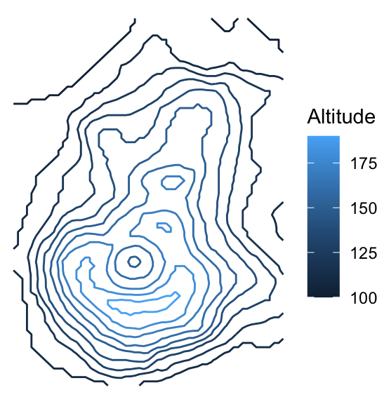
We can somewhat tell that the highest point is within the lightest blue area, just below the caldera. But, we would get a better sense of the terrain by adding more contour lines. You can use the bins argument in the geom_contour() function to indicate the number of altitudes for which to draw contours, or binwidth to specify a range of altitudes. Let’s make 20 contours with bins = 20:
ggplot(volcano_tidy, aes(longitude, latitude)) +
    geom_contour(aes(z = altitude, colour = ..level..), bins = 20) +
    theme_void() +
    scale_color_continuous("Altitude")

Method 2: Approximate a bivariate density: geom_density2d()
This method approximates a bivariate density from data.
First, recall how this is done in the univariate case. A little kernel function (like a shrunken bell curve) is placed over each data point, and these are added together to get a density estimate:
set.seed(373)
x <- rnorm(1000)
tibble(x = x) %>%
    ggplot(aes(x)) +
    geom_density()
We can do the same thing to get a bivariate density, except with little bivariate kernel functions (like shrunken bivariate Gaussian densities). But, we can’t just simply put “density height” on the vertical axis – we need that for the second dimension. Instead, we can use contour plots.
This is the contour plot that ggplot2’s geom_density2d() does: builds a bivariate kernel density estimate (based on data), then makes a contour plot out of it:
y <- rnorm(1000)
tibble(x = x, y = y) %>%
    ggplot(aes(x, y)) +
    geom_density2d() +
    theme(axis.title.y = element_text(angle = 0, vjust = 0.5))
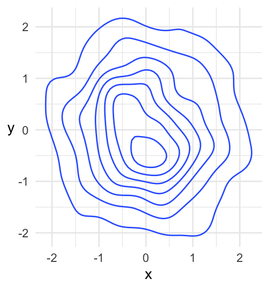
Based on context (this is a density), we know that this is a “hill” and not a “hole”. If you were to start at some point at the “bottom” of the hill, the steepest way up would be perpendicular to the contours. The highest point on the hill is within the middle-most circle.