Mixture distributions
UPDATE: For a clean implementation of mixture distributions, check out the distplyr R package.
This tutorial introduces the concept of a mixture distribution. We’ll look at a basic example first, using intuition, and then describe mixture distributions mathematically. See the very end for a summary of the learning points.
Intuition
Let’s start by looking at a basic experiment:
- Flip a coin.
- If the outcome is heads, generate a
N(0,1)random variable. If the outcome is tails, generate aN(4,1)random variable. We’ll let\(X\)denote the final result.
\(X\) is a random variable with some distribution (spoiler: it’s a mixture distribution). Let’s perform the experiment 1000 times to get 1000 realizations of \(X\), and make a histogram to get a sense of the distribution \(X\) follows. To make sure the histogram represents an estimate of the density, we’ll make sure the area of the bars add to 1 (with the ..density.. option).
library(tidyverse)
set.seed(44)
X <- numeric(0)
coin <- integer(0)
for (i in 1:1000) {
    coin[i] <- rbinom(1, size = 1, prob = 0.5)  # flip a coin. 0=heads, 1=tails.
    if (coin[i] == 0) {   # heads
        X[i] <- rnorm(1, mean = 0, sd = 1)
    } else {           # tails
        X[i] <- rnorm(1, mean = 4, sd = 1)
    }
}
(p <- qplot(X, ..density.., geom = "histogram", bins = 30))
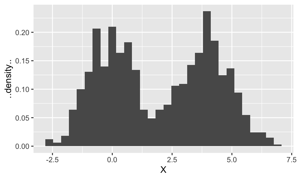
Let’s try to reason our way to figuring out the overall density. Keep in mind that this density (like all densities) is one curve. We’ll say we’ve succeeded at finding the density if our density is close to the histogram.
It looks like the histogram is made up of two normal distributions “superimposed”. These ought to be related to the N(0,1) and N(4,1) distributions, so to start, let’s plot these two Gaussian densities overtop of the histogram.
tibble(X = X) %>%
    ggplot(aes(X)) +
    geom_histogram(aes(y = ..density..), bins = 30) +
    stat_function(fun = function(x) dnorm(x, mean = 0, sd = 1),
                  mapping = aes(colour = "Heads")) +
    stat_function(fun = function(x) dnorm(x, mean = 4, sd = 1),
                  mapping = aes(colour = "Tails")) +
    scale_color_discrete("Coin Flip")
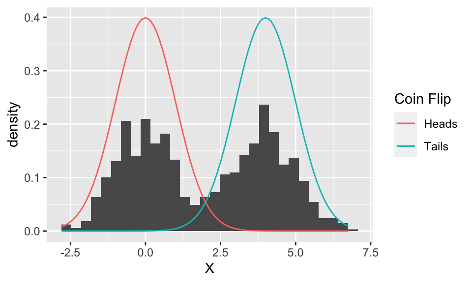
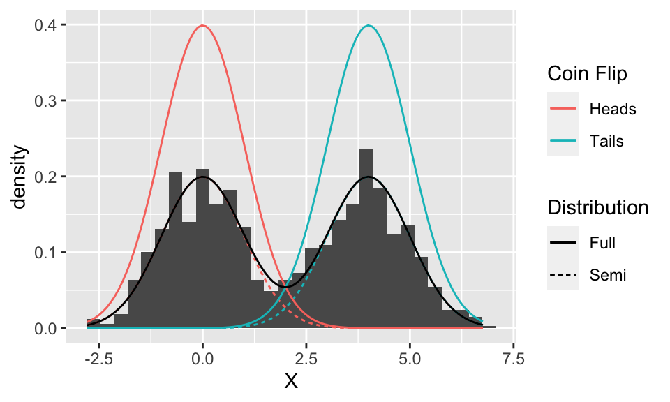
Well, the two Gaussian distributions are in the correct location, and it even looks like they have the correct spread, but they’re too tall.
Something to note at this point: the two curves plotted above are separate (component) distributions. We’re trying to figure out the distribution of \(X\) – which, again, is a single curve, and is estimated by the histogram. At this point, we only suspect that the distribution of \(X\) is some combination of these two Gaussian distributions.
So, why are the Gaussian curves too tall? Because each one represents the distribution if we only ever flip either heads or tails (for example, the red distribution happens when we only ever flip heads). But since we flip heads half of the time, and tails half of the time, these probabilities (more accurately, densities) ought to be reduced by half. Let’s add these “semi” component distributions to the plot:
(p <- tibble(X = X) %>%
     ggplot(aes(X)) +
     geom_histogram(aes(y = ..density..), bins = 30) +
     stat_function(fun = function(x) dnorm(x, mean = 0, sd = 1)*0.5,
                   mapping = aes(colour = "Heads", linetype = "Semi")) +
     stat_function(fun = function(x) dnorm(x, mean = 4, sd = 1)*0.5,
                   mapping = aes(colour = "Tails", linetype = "Semi")) +
     stat_function(fun = function(x) dnorm(x, mean = 0, sd = 1),
                   mapping = aes(colour = "Heads", linetype = "Full")) +
     stat_function(fun = function(x) dnorm(x, mean = 4, sd = 1),
                   mapping = aes(colour = "Tails", linetype = "Full")) +
     scale_color_discrete("Coin Flip") +
     scale_linetype_discrete("Distribution"))
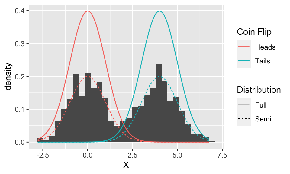
Looks like they line up quite nicely!
But these two curves are still separate – we need one overall curve if we are to find the distribution of \(X\). So we need to combine them somehow. It might look at first that we can just take the upper-most of the ‘semi’ curves (i.e., the maximum of the two), but looking in between the two curves reveals that the histogram is actually larger than either curve here. It turns out that the two ‘semi’ curves are added to get the final curve:
p + stat_function(fun = function(x) dnorm(x, mean = 0, sd = 1) * 0.5 +
                      dnorm(x, mean = 4, sd = 1) * 0.5,
                  mapping = aes(linetype = "Full"))
The intuition behind adding the densities is that an outcome for \(X\) comes from both components, so both contribute some density.
Even though the random variable \(X\) is made up of two components, at the end of the day, it’s still overall just a random variable with some density. And like all densities, the density of \(X\) is just one curve. But, this density happens to be made up of the components, as we’ll see next.
General Scenario
The two normal distributions from above are called component distributions. In general, we can have any number of these (not just two) to make a mixture distribution. And, instead of selecting the component distribution with coin tosses, they’re chosen according to some generic probabilities called the mixture probabilities.
In general, here’s how we make a mixture distribution with \(K\) component Gaussian distributions with densities \(\phi_1(x), \ldots, \phi_K(x)\):
- Choose one of the
\(K\)components, randomly, with mixture probabilities\(\pi_1, \ldots, \pi_K\)(which, by necessity, add to 1). - Generate a random variable from the selected component distribution. Call the result
\(X\).
Note: we can use more than just Gaussian component distributions! But this tutorial won’t demonstrate that.
That’s how we generate a random variable with a mixture distribution, but what’s its density? We can derive that by the law of total probability. Let \(C\) be the selected component number; then the component distributions are actually the distribution of \(X\) conditional on the component number. We get:
Notes:
- The intuition described in the previous section matches up with this result. For
\(K=2\)components determined by a coin toss\((\pi_1=\pi_2=0.5),\)we have $$ f_X\left(x\right) = \phi\left(x\right)0.5 + \phi\left(x-4\right)0.5, $$ which is the black curve in the previous plot. - This tutorial works with univariate data. But mixture distributions can be multivariate, too. A
\(d\)-variate mixture distribution can be made by replacing the component distributions with\(d\)-variate distributions. Just be sure to distinguish between the dimension of the data\(d\)and the number of components\(K\). - We could just describe a mixture distribution by its density, just like we can describe a normal distribution by its density. But, describing mixture distributions by its component distributions together with the mixture probabilities, we obtain an excellent interpretation of the mixture distribution. This interpretation is (it’s also called a data generating process): (1) randomly choose a component, and (2) generate from that component. This interpretation is useful for cluster analysis, because the data clusters can be thought of as being generated by the component distributions, and the proportion of data in each cluster is determined by the mixture probabilities.
Learning Points
- A mixture distribution can be described by its mixing probabilities
\(\pi_1, \ldots, \pi_K\)and component distributions\(\phi_1(x), \ldots, \phi_K(x)\). - A mixture distribution can also be described by a single density (like all continuous random variables).
- This density is a single curve if data are univariate; a single “surface” if the data are bivariate; and higher dimensional surfaces if the data are higher dimensional.
- To get the density from the mixing probabilities and component distributions, we can use the formula indicated in the above section (based on the law of total probability).